MUI stand for Material UI
- What: react library component implement base on
Google’s Material Design - Why: It provides a wide range of pre-built, customizable components: MUI includes a variety of components such as
buttons, forms, tables, and navigation bars, which you can use to build your app quickly and easily. - Who: BE or FE.
Don’t want to build from scratch. Focus to prototype and logic.
- Table of content
Installation
yarn add @mui/material @emotion/react @emotion/styled
@mui/material library component material ui
@emotion/react, @emotion/styled are used default for style engine
How to customize component Button

1. Use UI Props
<Button variant="text">Text</Button>
<Button variant="contained">Contained</Button>
<Button variant="outlined">Outlined</Button>
Customize by passing props to component Button.
variant: variant of button to use (contained,outlined,text)color: color of button (primary,secondary,success, …)size: size of button (small,medium,large)
Explore all available props on MUI Button Props
Pros:
- Easy to use and customize
- Consistency style
- No need to remember all props and value (Typescript)
Cons:
- Limit options
- Default Material Design
2. Use className Prop
If you want to override a component's styles using custom classes, you can use the className prop, available on each component.
.primary-button {
  background-color: #000;
}

/* Increase the specificity */
.MuiButton-root.primary-button {
  color: #fff;
  background-color: #2065d1;
}
<Button className="primary-button">Primary Button</Button>
Pros:
- Extend customize component by CSS property
No run time cost- Just CSS, no learning curve
Cons:
Hard to remember class- Need to
write specific selector to overrideselector of component. Even use!importantto apply style (Learn more how to CSS injection order) - It this style already exist class? 😑
orOkay write new class name 🤣
3. Use Sx Prop
The [sx prop](https://mui.com/system/getting-started/the-sx-prop/) is the best option for adding style overrides to a single instance of a component in most cases. It can be used with all Material UI components.
<Button
  sx={{
    bgcolor: "#000",
    mr: 2,
    mb: 1,
    "&:hover": { bgcolor: "#000" },
  }}
>
  Primary Button
</Button>
Pros:
- Less boilerplate code, easy to style, just like
styleprops to style inline - Shorthand CSS property
mr⇒margin-right - Access theme value
primary.main⇒theme.palete.primary.main - No need to switch context component and style
- No need to name
Cons:
- If you duplicate or so much style, your code will messy quickly
- No centralize ⇒ when design change, we need to find by and by
sx - It is not the best option for extending component styling for reuse
🧑💻 Only use sx for one-off customize
- Show code painful 😂
<Button sx={{
        bgcolor: '#000', mr: 2, mb: 1,
        '&:hover': { bgcolor: '#000'}
}}>
    Primary Button
</Button>
<Button sx={{
        bgcolor: '#0099ff', mr: 2, mb: 1,
        '&:hover': { bgcolor: '#000'}
}}>
    Secondary Button
</Button>
<Button sx={{
        bgcolor: '#2065d1', mr: 2, mb: 1,
        '&:hover': { bgcolor: '#000'}
}}>
    Primary Button
</Button>
4. Use styled utility
To reuse the same overrides in different locations across your application, create a reusable component using the [styled()](https://mui.com/system/styled/)
import Button, { ButtonProps } from "@mui/material/Slider";
import { alpha, styled } from "@mui/material/styles";

export const StyledButon = styled(Buton)<ButtonProps>(({ theme }) => ({
  width: 300,
  color: theme.palette.success.main,
}));

export default function StyledCustomization() {
  return <StyledButon size="large">Hello</StyledButon>;
}
Pros
- Abstract all styling changes and package them into a new component
- Familiar with
Styled Compnents
Cons
- Need to warp component to re-style, even only one property
- Naming for component
- If no document, team member won’t know and create a new
Don’t know this component is real component or styled component- Using the API requires knowledge of it’s syntax
Use styled for reusable component
4. Custom Theme

import { createTheme, ThemeProvider } from "@mui/material/styles";
import Button from "@mui/material/Button";

const theme = createTheme({
  palette: {
    primary: {
      main: "#9c27b0",
    },
    secondary: {
      main: "#11cb5f",
      contrastText: "#fff",
    },
  },
  components: {
    MuiButton: {
      // change default prop MUI Button
      defaultProps: {
        variant: "contained",
        disableElevation: true,
      },
    },
  },
});

export default function Palette() {
  return (
    <ThemeProvider theme={theme}>
      <Button>Primary</Button>
      <Button color="secondary">Secondary</Button>
    </ThemeProvider>
  );
}
You can also custom new color. (See tutorial here)
<Button color="neutral">neutral</Button>
Pros
- The most abstract option. Teammates might use components and not even know they had an overridden theme (this is usually a good thing but can cause problems)
- The ThemeProvider allows the overridden styles to be applied to specific sections of the app
Cons
- Overriding the theme requires knowledge of theme override syntax
Just follow the file design system. if your designer no provide, you can request them. If even no, you can collect same style and add it to theme
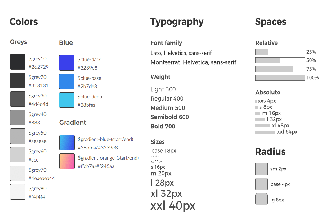
- Designer and developer create design token together to match scene
- Designer use it to change style on Figma
- Developer use it to change style component
<Typography variant="l">Typography L</Typogaphy>
<Typography variant="xl">Typography XL</Typogaphy>
<Typography variant="xxl">Typography XXL</Typogaphy>
<Buttton color="blueDeep">Button</Button>
Explore more
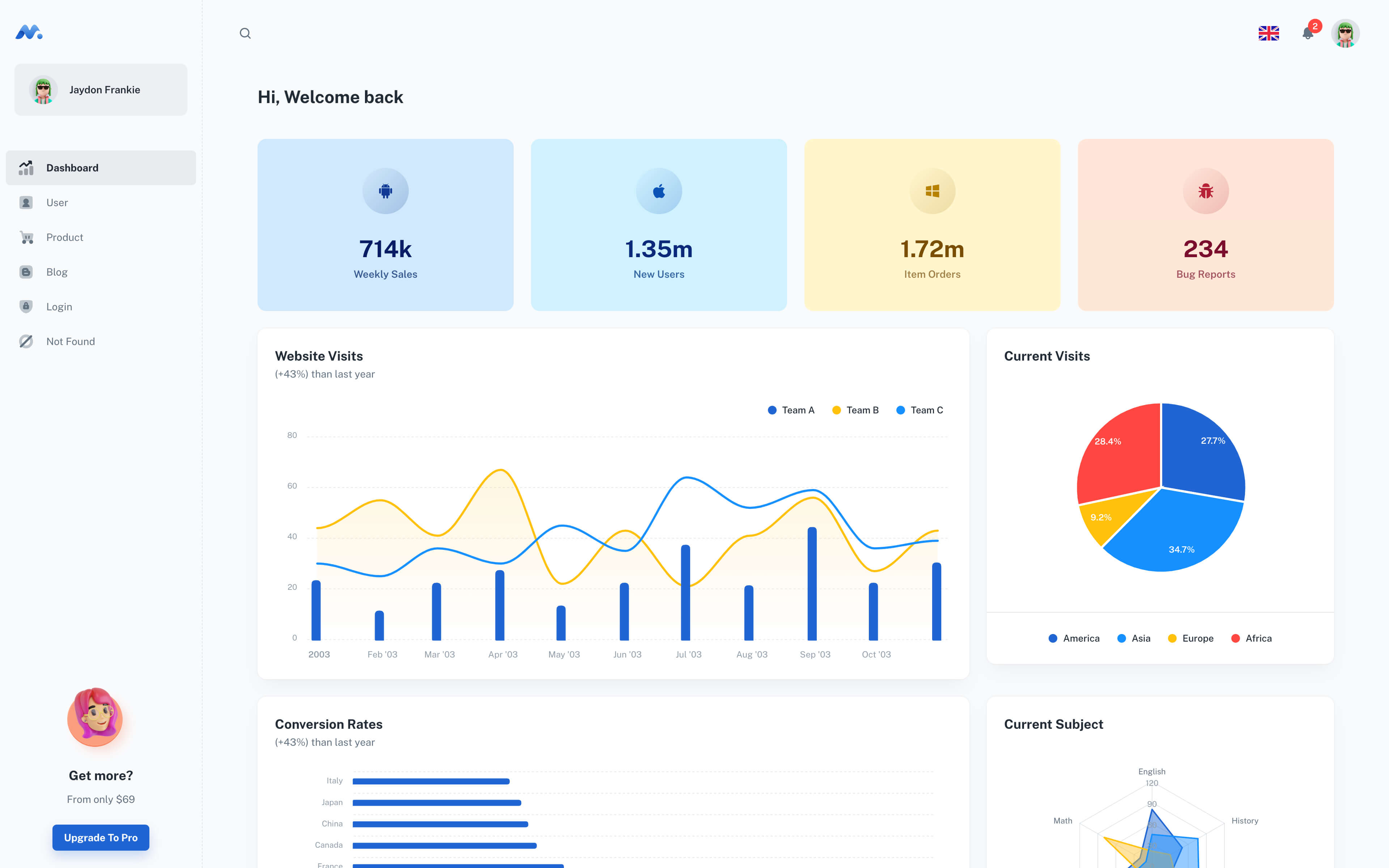
Minimal Dashboard - build with React Material UI components.
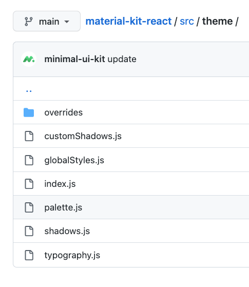
You can base on folder theme to setup code base MUI for new project 😘
typographycustom typography of themepalettecustom color of themeglobalStylesadd global style for themeoverridesfolder contain all override MUI componentButtonoverride ButtonTypographyoverride Typography